Written by Sam Waller, Engineering Design Centre, University of Cambridge, April 2022
Since 2008, the Web Content Accessibility Guidelines (WCAG) contrast formula has implied that the legibility of text on websites can be predicted according to the ratio of the amount of light that the monitor emits for the brightest colour, compared to the darkest colour. If all other text parameters are equal, then bigger ratios mean the text ought to be more legible.
The WCAG contrast formula also forms the basis of Section 508 compliance, which is legally binding, and is likely to have governed billions of dollars of ICT procurement contracts around the world, for governments and other public agencies.
However, since January 2022, the Advanced Perceptual Contrast Algorithm (APCA) now proposes a more complicated formula. Most importantly, the new formula claims that the legibility of text on websites is better predicted by considering the perceived difference in the amount of light that the monitor emits for the two colours, rather than the ratio. This difference is named the ‘Lightness Contrast’ (Lc). If all other text parameters are equal, then Bigger Lc values mean the text ought to be more legible.
See Footnote 1 for a discussion of legibility vs readability, more detail on APCA, and the impact of text size. See Footnote 2 for additional notes on the impact of colour impairments. All RGB values stated in this article refer to sRGB colour space, which is the default for the web.
This article examines the extent to which these algorithms successfully predict the legibility of text, for coloured backgrounds containing text that is either white or black. Apart from the text colour, all other text parameters are identical. Some greyscale examples of these are shown below.
The situations where the two algorithms contradict each other will now be considered in more detail, first for greyscale backgrounds, and then for coloured backgrounds. For each of the examples that are presented, the reader is encouraged to determine whether the black text appears to be more legible, or the white text appears to be more legible.
Important note: The perceived legibility of text can vary between different people, different display screens, different lighting conditions, and other factors. The interactive exercises on this page have been created to give you an indication of which algorithm is better at predicting the legibility of text, for your vision, on the display screen you are currently looking at. As described in the conclusions, further research is needed to confirm which algorithm is better for the diverse range of people and the display screens that they use.
For dark background colours (RGB<118), both algorithms predict that white text is more legible. For bright background colours (RGB>163), both algorithms predict that black text is more legible. However, for backgrounds with RGB values between 118 and 168, the two algorithms contradict each other. For any background within this range, ‘WCAG Contrast Ratio’ predicts that black text is more legible, whereas ‘APCA Lightness Contrast’ predicts that white text is more legible.
The ovals below show black text (RGB0) and white text (RGB255) against the range of background colours for which the two algorithms contradict each other.
To determine which algorithm is better at predicting legibility (for you), increase your viewing distance until the numbers in the middle oval (RGB145) become slightly difficult to read, then identify the oval where the black text and the white text appear equally easy to read.
If the balance occurs close to the top oval (RGB118), then ‘WCAG Contrast Ratio’ is better at predicting legibility (for you). If this balance appears close to the bottom oval (RGB163), then ‘APCA Lightness Contrast’ is better at predicting legibility (for you).
The button below the ovals can be used to change the page colour to black. Click this button, and see how much difference the page colour makes to the crossover position. Also, see how much difference it makes if you complete this exercise on mobile, and on different monitors, operating systems, and lighting conditions.
The algorithms are now compared for randomly generated background colours (see Footnote 3 for further details).
In the ovals below, each background colour represents a case where ‘WCAG Contrast Ratio’ and ‘APCA Lightness Contrast’ contradict each other. In each case, ‘WCAG Contrast Ratio’ predicts that the black text is more legible, whereas ‘APCA Lightness Contrast’ predicts that the white text is more legible.
For each oval, the text describes the corresponding ‘WCAG Contrast Ratio’, and the ‘APCA Lightness Contrast’, for the black text and the white text respectively.
Important note: Some people may find that looking at the ovals below gives them a headache. If you experience any visual discomfort, please stop looking at these ovals and find a natural scene to look at instead.
To determine which algorithm is better at predicting legibility (for you), increase your viewing distance, until the numbers in the ovals become slightly difficult to read. Then, looking across all the colour combinations, count the number of ovals where the black text is more legible, and count the number of ovals where the white text is more legible. If there are more ovals where the black text is more legible, then the ‘WCAG Contrast Ratio’ is better at predicting legibility (for you). Conversely, if there are more ovals where the white text is more legible, then ‘APCA Lightness Contrast’ is better at predicting legibility (for you).
The button below the coloured ovals can be used to change the page colour to black. Click this button, and see whether this changes the number of ovals where the black text is more legible. Also, see how much difference it makes if you complete this exercise on mobile, and on different monitors, operating systems, and lighting conditions.
Please use my LinkedIn article to report the results that you get, and discuss these with others.
I generated 8000 random colour backgrounds (RGB[X,Y,Z] in the range 0-255). 5298 of these background colours passed ‘WCAG Contrast Ratio’ > 4.5 for black text. However, 47% of the 5298 colours that passed ‘WCAG Contrast Ratio’ > 4.5, subsequently failed APCA Lc > 60. So, if the ‘APCA Lightness Contrast’ is more accurate, then the range of possible background colours for black text reduces by approximately 47% (for these particular thresholds).
Furthermore, 2848 random background colours passed ‘WCAG Contrast Ratio’ > 4.5 for white text. However, 4629 random background colours passed APCA Lc > 60 for white text. So, if the ‘APCA Lightness Contrast’ is more accurate, then the range of possible background colours for white text increases by approximately 63% (for these particular thresholds).
This article has examined the legibility of white and black text against coloured backgrounds, which is particularly relevant for buttons and menu headings. However, there are many other possible uses of these algorithms, especially:
Although lots of research has already been done (in controlled environments) to develop the ‘APCA Lightness Contrast’, This author would be glad to see further research to confirm which algorithm is more accurate for:
If the ‘APCA Lightness Contrast’ does indeed prove to be the better model for all of these different use cases, then:
Additionally, the examples in this article show that black text on coloured backgrounds becomes considerably more legible when the page background becomes black. At the time of writing in March 2022, both ‘APCA Lightness Contrast’ and ‘WCAG Contrast Ratio’ were two-colour models that do not account for the effect of the page background, which limits the accuracy of the models. Attempting to optimise a universally applicable two-colour model will necessarily involve attempting to find a compromise that is equally inaccurate for both black page backgrounds and white page backgrounds, and further research may be required to resolve this issue.
The threshold for fluent readability of paragraphs of text typically reflects whether the reader can achieve their maximum possible reading speed. The threshold for legibility typically reflects whether the individual letters or words can be distinguished, when the eyes are stationary and focused on the letters.
Readability is a much higher-level visual function, which depends on the speed at which the brain can perceive the shapes of words, while the eyes scan across the text.
Both legibility and readability critically depend on the size of the text, the contrast difference between the foreground and background colours, and other factors. Although WCAG and APCA have different approaches for considering the impact of text size, this doesn’t affect the comparisons of black text and white text presented here-in, because the black text and the white text are presented at the same size.
Furthermore, most text on websites should be designed to support the reader’s maximum possible reading speed. However, this article aims to compare the 'APCA Lightness Contrast' and ‘WCAG Contrast Ratio’ algorithms via a series of quick examples, so this article focuses on legibility, because it’s quicker and easier to demonstrate. Considering which algorithm is more accurate for predicting the readability of paragraphs of text is listed as one of the actions for further research. Nevertheless, I would be surprised if measuring readability would change the conclusion regarding which algorithm is more accurate.
The ‘APCA Lightness Contrast’ reports positive values of Lc when the text is darker than the background, and negative values if it’s the other way round. In the examples shown in this article, the primary concern is whether the legibility is predicted to be higher with black text or white text. So, for simplicity, all the reported values of Lc have been expressed in terms of their magnitude, ignoring the polarity.
The eye perceives light using 3 different cones, one of which is most sensitive to red light, another to green light, and another to blue light, as shown below.
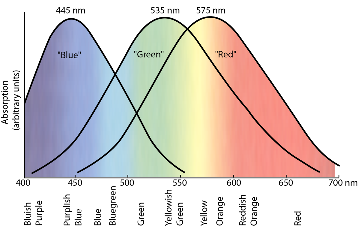
Image credit: from HyperPhysics by Rod Nave, Georgia State University.
Although commonly grouped together and called ‘colour-blindness’, this article uses the term ‘colour impairments’ to describe the loss of sensitivity of one or more of these cones. The degree of sensitivity loss can be different between people, and can vary over time.
Protanopia occurs when the red-sensitive cones are impaired, Deuteranopia occurs when the green-sensitive cones are impaired, and Tritanopia occurs when the blue-sensitive cones are impaired. Impaired red-sensitive and green-sensitive cones are approximately equally likely, but impaired blue-sensitive cones is rarer. Multiple cones being impaired is also possible, but even rarer.
The extent to which the eye can discriminate text from its background primarily depends on both the hue contrast (colour difference), and the lightness contrast. Colour impairments can dramatically reduce hue contrasts, so lightness contrasts are more robust than hue contrasts, especially for readability, which partly relies on peripheral vision.
Both APCA and WCAG ignore hue contrasts, and both methods involve using the following formula to predict the amount of light that is emanating from the screen, based on the RGB colour values: 0.2126*R2.4 + 0.7152*G2.4 + 0.0722*B2.4.
However, this formula is based on a full-colour model of vision. If these models were to be adapted to specifically consider impaired red-sensitive cones, all of the multipliers in the above formula would likely need to change, and the multiplier in front of the R term would likely be much closer to 0.
The image below shows a variety of simulated colour impairments for a variety of colour combinations (Image produced by the Myndex Brettel CVD Sim).
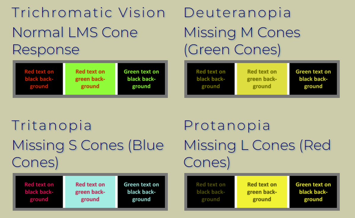
The above image shows that the most problematic combination of colours and impairments occurs for people with impaired red-sensitive cones (Protanopia) trying to distinguish between red and black.
However, pure red on pure black still gives a ‘WCAG Contrast Ratio’ of 5.3:1, which passes the recommended minimum for Level AA. Comparatively, ‘APCA Lightness Contrast’ is Lc=40 for this colour combination, which fails the recommended minimum for any website text that ought to be readable.
APCA penalises red on black considerably more than WCAG, so this author believes that APCA is considerably better than WCAG for ensuring legibility for those with colour impairments. Nevertheless, APCA still uses a full colour model to calculate luminance, and this author would be glad to see further research to consider how the multipliers within the luminance equations might be modified to better predict the legibility for those with different kinds of colour impairments.
When automated checkers are used to calculate whether a particular colour combination passes or fails, this author thinks the result should be reported separately for full-colour, red-impaired and green-impaired as a minimum, and the overall result should only be a pass if all three of these values pass.
The example colours that are shown on this page were selected from the 8000 random colours, looking for specific instances where:
The colours were then further filtered to look for instances where ‘WCAG Contrast Ratio’ determined that the black was only slightly more legible than the white, with the black contrast being not more than 50% higher than the white contrast, and to select the colours that were most different from each other (in RGB coordinates).
© 2022 University of Cambridge